London’s Spring Windows
A round up of some of London's West-End Spring Windows by John Ryan. John Lewis, Oxford Street “Colour in your spring” is on view almost everywhere you might care to look in John Lewis’ Oxford Street flagship -

A round up of some of London’s West-End Spring Windows by John Ryan.
John Lewis, Oxford Street
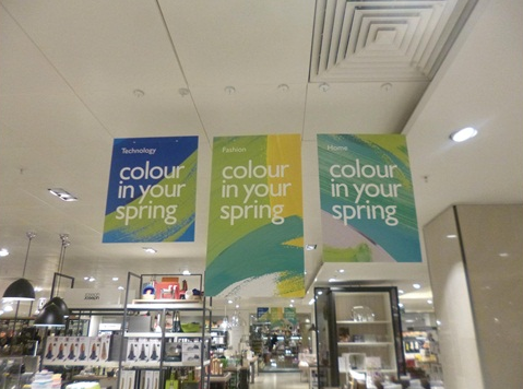
“Colour in your spring” is on view almost everywhere you might care to look in John Lewis’ Oxford Street flagship – and it takes the form of green and blue paint. More accurately, the visual merchandising team has adorned multiple surfaces with decals designed to look like dripping paint.
The theme starts in the windows and continues across the store with the upper perimeter behind the cash desks and the balustrades in the large atria all subject to the paint motif.
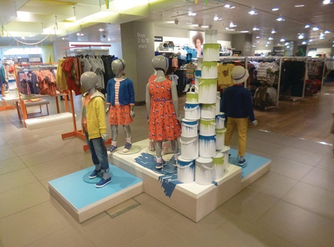
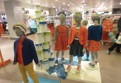
It is backed up by in-store displays that pick up on the colour theme. And in case the point is missed, cans of paint with green and blue drips around their tops are piled high around the mannequins, furniture and suchlike.
The roomsets in the atria can be viewed en masse by those using the many escalators, and they really take what has been done in the windows and run with it.
John Lewis is unusual in department store terms in not having to deal with large numbers of concessions with their own display agendas. Practically this means there is a uniformity of approach across this very large store that sets it apart from its rivals.
Selfridges, Oxford Street
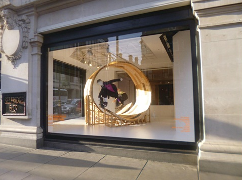
More often than not the best window at Selfridges is at the west end of the department store’s long frontage, where it wraps around the building. And the present display in this glass box is no exception.
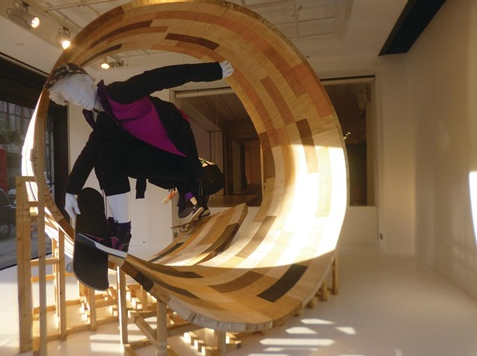
A pair of skateboarding mannequins are midway through attempting to navigate a wooden marquetry tunnel, which is supported by a scaffolding frame, also in wood.
Like John Lewis, this window is a teaser for the in-store action – in this case the ‘board games’ campaign that aims to pick up on what Selfridges says is “this season’s surf and skate trend”.
Walk into the shop and ‘the concept store’ area immediately behind this window has morphed into ‘the board room’ – a space in which limited-edition skateboards are on offer includes versions from designers such as Stella McCartney, Rick Owens and Christian Louboutin, Maison Martin Margiela and Alexander McQueen.
In total, this promotion occupies a relatively small part of Selfridges, but the window is sufficiently eye-catching for it to punch above its weight. As the days grow longer this has a spring-like feel about it.
Liberty, Great Marlborough Street
Art Nouveau department store Liberty has taken puzzles as the theme for its windows, although quite what that has to do with spring is open to debate.
Nonetheless, it does have the ability to cause passers-by to pause and take a look.
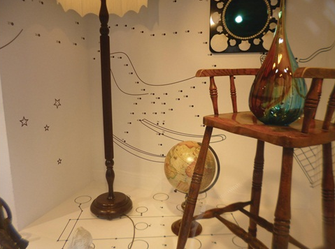
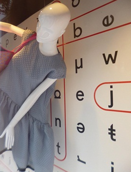
The window displays vary from mannequins suspended in front of word-search games, to join-the-dots backdrop graphics for displays filled with furniture.
Look carefully at the word-search window and it becomes apparent that the red lines that demarcate various words in fact serve to highlight the names of some of the designers that are stocked.
And in order to maintain the momentum created by the windows, visitors to the store’s website can download a games sheet and then tweet their answers, accompanied by an appropriate hashtag.
The other point about these windows is the positioning given to the mannequins. They appear to be in some kind of free-fall that has them upside down, horizontal and upright. It’s hard not to admire.
Tommy Hilfiger, Regent Street
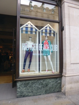
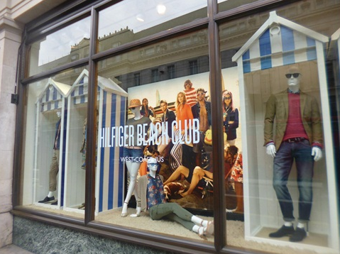
The visual merchandising team at Tommy Hilfiger seems largely to have forgotten about spring, opting instead to head straight into summer with a series of windows that show figures emerging from beach huts accompanied by the legend ‘Hilfiger Beach Club’.
The semi-Edwardian aesthetic is countered by the mannequins themselves, which have a contemporary feel. This is reinforced by a large graphic showing winsome-looking types, male and female, in a group in a beach setting.
There is nothing complex about it, but what the scheme does manage to achieve is a feeling of freshness that is entirely in keeping with the new season, spring or summer.
In these windows the devil is in the detail. The sense of humour that is evident in, for instance, a Ray Ban-wearing Basset hound at the foot of one of the windows brings a smile to the face. The beach huts also provide a convenient frame for each of the mannequins.
Topman, Oxford Circus
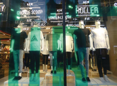
If there is one thing that marks out Topman at Oxford Circus from the competition it is the consistent simplicity of its large window on the right hand side of the Topshop/Topman flagship.
The displays in this window almost always consist of a troupe of male figures adopting a quasi-military stance, and the current scheme is no exception.
As was the case with all of its predecessors, if the onlooker stands in front of this display for more than a minute or so, the chances are they will see others using their digital cameras and phones to capture what has been created.
In this instance, green transfers have been applied to the glass-line, adding a hint of colour to the generally monochrome figures within.
Above the mannequins, the theme of simplicity is continued thanks to a series of white fluorescent tubes that have been shaped to provide words such as ‘grunge scoop’, ‘longer length’ and ‘classic screw’.
Couple all of this with the fact that the mannequins are in a group, but it is not uniform because of a series of plinths of varying heights, and the shopper is offered a show-stopper.
Generally, a good idea trumps throwing money at a window display and this is a case in point.
via RetailWeek
 English


