The World’s Best Retail Playgrounds Right Now
Retailers are innovating across the globe in a huge variety of ways – and that innovation is perfectly exemplified in retail displays. Engaging displays and visual merchandising are a key part of how physical retailers

Retailers are innovating across the globe in a huge variety of ways – and that innovation is perfectly exemplified in retail displays. Engaging displays and visual merchandising are a key part of how physical retailers can continue to drive footfall, awareness and loyalty.
From extraordinary facades and unusual interiors to eco-friendly displays and art installations, here’s our take on the 50 best retail displays (in alphabetical order) on the planet.
1. Adidas Flagship (London)

Adidas’ much-hyped London flagship opposite Selfridges is full of innovative displays and bold visuals.
Firstly, the store has been designed with flexibility in mind – movable cabinets and displays are found on every floor that allow Adidas to easily create a new activation or collaboration. Sustainability is intelligently visualised too. A dedicated ‘Marley’ sneaker display explains how the groundbreaking product is made using ocean plastics. Augmented reality displays are also abundant, adding an extra visual layer to sustainability storytelling and promoting visuals.
2. Aesop (Sydney)
Located in Westfield Bondi Junction, the new Aesop store has been designed to evoke 1960s Australian homes. Created by Mlkk Studio, the space has been made using pinewood planks and panels, including a stud wall vaasard, to appeal to the largely local Australian customer base. The timber has been sourced from a nearby woodwork store to minimise costs but also in support of the ‘local’ theme. This feeling of ‘local’ is reflected throughout the store with the interiors resembling the design trends of the 70s. There is even a ceramic coffee cup display further capturing domestic life in the 60s and 70s.
3. Anya Hindmarch (London)

Luxury handbag designer Anya Hindmarch has launched the ’I am a plastic bag’ collection for London Fashion Week in favour of a catwalk show. The designer has filled her London stores with plastic bottles to make a statement about waste. From the outside the windows are filled with empty plastic bottles to highlight the new collection’s use of recycled plastic. The stores will be closed for three days over Fashion Week to keep the focus on the displays and, ultimately, the message. Ninety-thousand used plastic bottles have been obtained to fill the stores which is shockingly the amount that are purchased globally every six seconds.
4. APL (LA)
Sneaker brand APL’s first store in LA is defined by its long narrow space that is both dramatic and serene. As the store is located in the ‘City of Angels’ the founders wanted to conjure up an image of ‘heaven’. The high ceilings, narrow width and runway-like depth are immediately noticeable in this extraordinary store. Whilst the space itself is incredibly dramatic, the overall aesthetic is not in competition with the sneakers on display and they still manage to be the star of the show.
5. Apple (NYC)
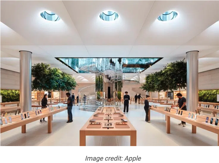
The iconic Apple store on Fifth Ave has been fully refurbished and redesigned, with lots of features that set it apart from the rest. Our favourite is the 62 circular lights that surround the iconic cube entrance and allow natural light to flood into the underground space. At night they illuminate the plaza. Nine of these, known as the ‘sky lenses’, rise out of the ground for more dramatic visual effect. The reflective capsules also double up as public seating so people can enjoy the experience for longer.
6. The Arrivals OutThere Lab (NYC)
Fashion retailer The Arrivals created a weather-themed pop-up to promote its clothing in the elements. Three different shopping zones were created to reflect three different microclimates. LED lights broadcast the weather in three cities – Tokyo, Berlin and New York – and the clothes are displayed to reflect dressing in those climates. Everything in the store is white with neon accents which means that the clothing can take centre stage.
7. Axel Arigato (Copenhagen)
Swedish footwear retailer Axel Arigato’s flagship store in Copenhagen is a minimalist, brutalist space developed with Stockholm-based architect Christian Halleröd. The huge, raw concrete staircase dominates the space – and the entire store matches this same grey concrete look. The only exception are the bum-shaped sculptures by Brazilian artist Kiri-Una Brito Meumann, which inevitably really stand out. The shoes are sparsely laid out which creates a dramatic overall visual feel.
8. Benefit Cosmetics pop-up (London)
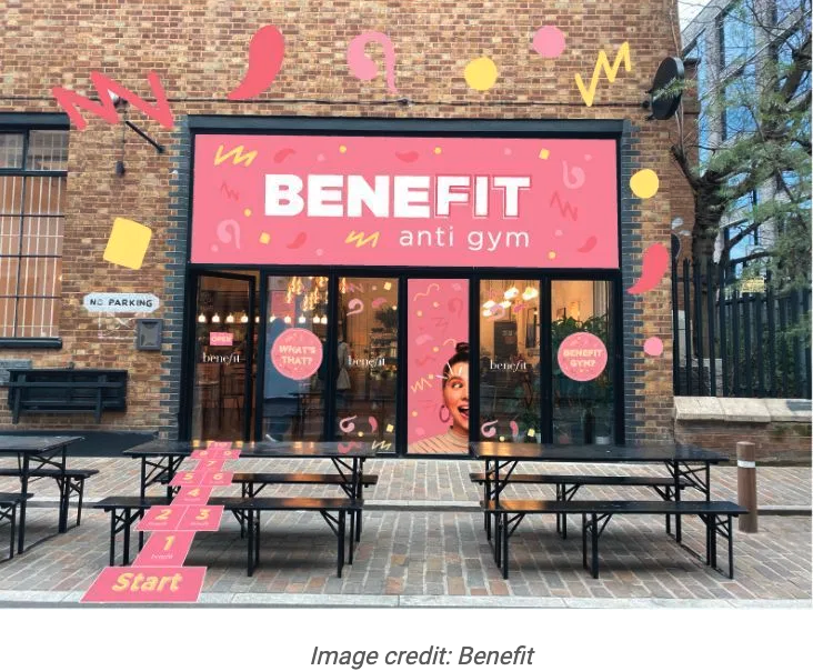
Beauty giant Benefit Cosmetics launched an immersive pop-up in Shoreditch called the BeneFIT Anti Gym. Customers are encouraged to work on their brows, not their biceps. To coincide with the launch of its new eyebrow palette, the shop fit is that of a very pink and very Instagrammable gym – complete with pink ‘lucky lockers’ full of Benefit goodies that customers can win a key to unlock. This is a gym people will not want to leave in a hurry.
9. Benetton Printemps pop-up (Paris)
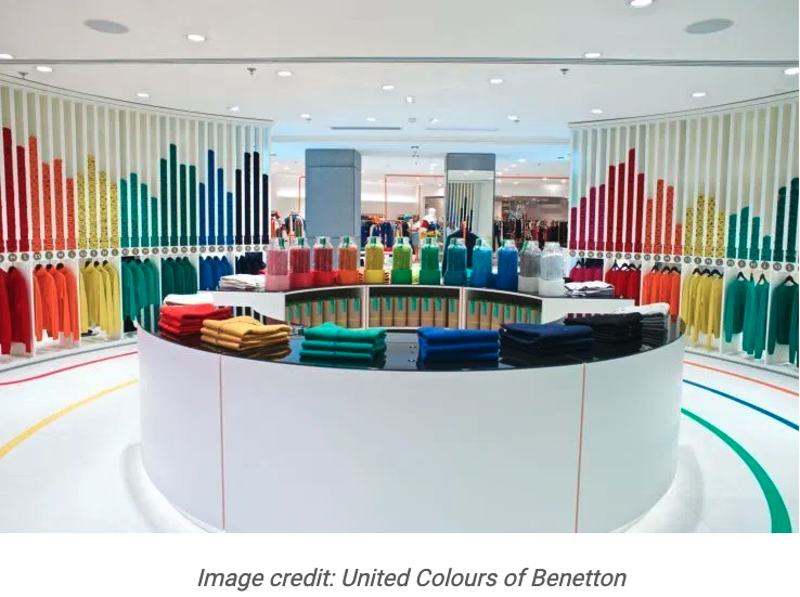
Benetton created a ‘rainbow theatre’ pop-up in Printemps that was bold and eye-catching. Without needing to use any tech, the space was a sensory experience with the focus being on the colour palette. An installation on the wall of paint tins pours graphical lines of paint down the walls and onto the floor. The same designs are used on the clothes, along with jars of sweets and seating. It is a simple yet striking display of colour.
10. Box by Posti (Helsinki)
Finnish postal service Posti has created Box as the middleman between online ordering and delivering to your home. Customers can instead get their orders sent here where they will be held in lockers until they are ready to collect them. The space has been beautifully designed by design studio Fyra, where the lockers are accompanied by changing rooms as well as areas to relax whilst you wait. Everything is of the moment from the pale pink lockers to the dedicated recycling area.
11. Camper (Barcelona)
Kengo Kuma led the renovation of Camper’s Barcelona store, and decided to use an ancient Catalan construction method involving vaulted ceramic plates. The beautiful technique is used throughout, from furniture to shelves holding the shoes. This creates a unique visual identity, but importantly it also builds a strong localised link to the design heritage of Barcelona.
12. Canada Goose (Toronto)
Canadian outerwear retailer Canada Goose has a new store in Toronto that doesn’t sell any coats. Instead customers are invited to try on a coat before being transported to the ‘Cold Room’ – a -12 C room with real snow. This room can be accessed via a glass walkway that mimics the sounds of cracking ice as you walk across it. Once in the room you will be met with floor-to-ceiling screens displaying arctic landscapes.
13. Claus Porto (NYC)
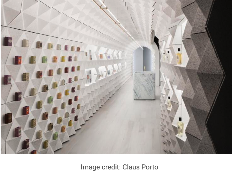
One hundred and thirty one year-old beauty and fragrance retailer Claus Porto enlisted the help of Tacklebox Architecture to help create its boutique in NYC. The small interior is a long alleyway filled with a freestanding crinkled structure that is able to house and display its products by providing ledges for the items to sit on. The vaulted design is said to represent the arched portals of São Bento train station in Porto to highlight the brand’s heritage within the store.
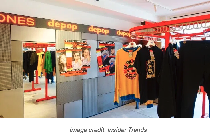
14. Depop at Selfridges (London)
Fashion marketplace app Depop opened a pop-up in Selfridges to showcase the app. The items of clothing were displayed on moving red rails, similar to those found at dry cleaners. Each week it showcased different Depop sellers who exhibited a curated selection of vintage, luxury, streetwear and independent designers
15. En (Paris)
Japanese beauty spa En has an outpost in Paris designed around the theme of Japanese tea ceremonies and french wineries. Occupying an 18th century building, the space has been designed by Paris based architects Archiee. The space resembles a wine cellar with exposed brickwork and gold fixtures that makes it feel historic and beautiful at the same time.
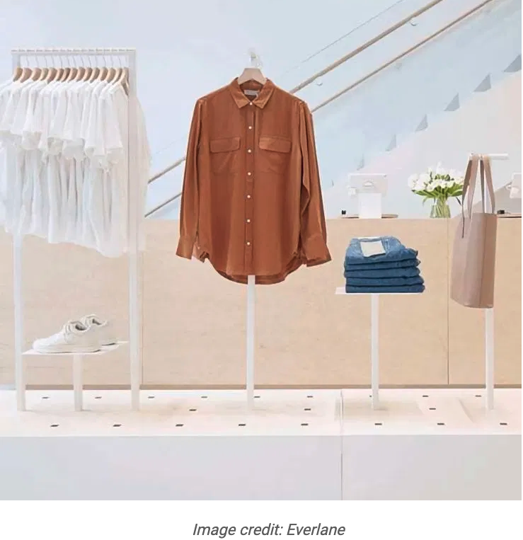
16. Everlane (Williamsburg, NYC)
Everlane’s store in trendy Williamsburg is a large but welcoming space full of light and minimalist design. The wood and concrete floors add some texture to the otherwise white space – and this sense of space and light is the perfect way of visualising the brand’s ethically produced range. A tree also occupies the centre of the double height space, surrounded by seating for customers to relax in – all of which adds to the tranquil feeling.
17. Fig (Vancouver)
Fig Facial Bar is an oasis of green in Vancouver. It features painted soft greens, scalloped green walls, green basins, dark green velvet curtains and light green barber chairs. But somehow, all that green works together perfectly to create a calming and visually unique space – which is testament to the skill of the designers, Scott & Scott.
18. Forte_forte (Tokyo)
Forte_forte Tokyo is the Italian clothing retailer’s first boutique in Japan. The store’s design combines brass, travertine and gold leaf, which gives it a distinct and delicate feel, much like its spaces in Milan, Paris and London.
19. Fortnum & Mason Chapel of Love (London)
Iconic department store Fortnum & Mason has opened a wedding chapel installation where visitors can actually get married. It is London’s first in-store wedding chapel and has been designed around the central staircase. Decked out in pastel hues that are in-keeping with the store’s tasteful interior, it fills three floors of the atrium. It takes the concept of in-store experiences to a new level.
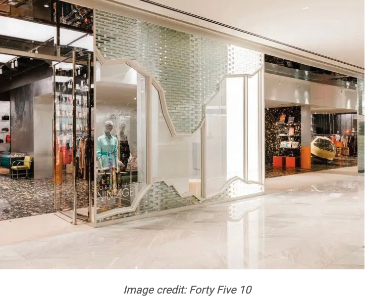
20. Forty Five Ten (New York)
Located at Hudson Yards, this store is a fusion of art and fashion. Created by design studio Snarkitecture, the glass brick storefront makes an immediate and dramatic impression on the customer. Like its other boutiques, the store features a number of bold artworks interspersed with the products, which really elevates the status and focus of each item.
21. Freitag (Zurich)
Freitag’s Zurich concept store focuses on its well-known ‘make your own’ recycled tarp bag station. The microfactory that conducts this hands-on process takes centre stage in the space, and that’s precisely what makes this store visually engaging.
22. Gacha Gacha coffee (Tokyo)
Japanese coffee brand Maruyama Coffee has opened an unmanned cafe, Gacha Gacha, where customers are their own baristas. The striking black and copper design adds to the uniqueness of this space with every element – from capsule vending machines to grinding stations – featuring the same sleek design. It’s a feast for the eyes as well as the taste buds.
23. Gentle Monster (Shanghai)
Gentle Monster is well known for its eye-catching displays and multisensory experiences that transcend traditional retail design, and the Shanghai flagship is one of its finest examples. A series of rooms feature unique ideas such as woven sculptural creatures, piles of soil, wooden boats and pieces of technological equipment. Like all of its global stores, its retail displays are like no other.
24. Glossier pop-up (London)
The Glossier pop-up in London is packed with retail displays that are entirely true to the brand. The series of rooms through narrow doorways (think of a classic London terraced home) feature floral patterned wallpaper and displays, and a huge range of bold colour combinations. There’s also a Glossier rooftop which pays homage to the London skyline. If you haven’t seen it for yourself, you’ll probably have seen it on Instagram.
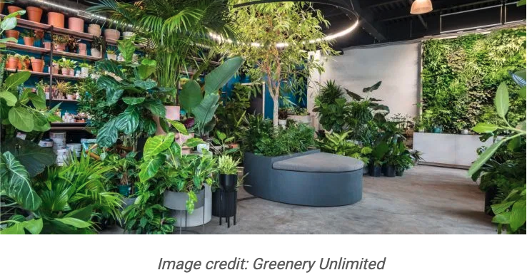
25. Greenery Unlimited (NYC)
Located in Brooklyn you will find New York’s ‘greenest store’ from the people behind botanic design studio Greenery NYC. The store is packed with foliage for sale from cacti to ferns and creepers. The space feels more like a botanical garden than a store and the 120 sq ft wall of plants adds to that feeling. The space is tapping into a growing trend for plant filled interiors, designed to reduce stress and anxiety. The seating areas have been designed for customers to soak up the surroundings.
26. Harmay (Hong Kong)
Cosmetic retailer Harmay’s Hong Kong store is a beautiful space that’s dominated by a steely metallic design. Most notably, the walls of the main floor are lined with unlabelled stainless steel drawers packed with products. Hints are given about where to find certain products, but for the most part customers just have to open them and see what’s inside. This simple concept makes the space uncluttered and adds a genuine sense of discovery.
27. Hermès (Amsterdam)
Hermès glass brick-fronted Amsterdam store is visually striking long before you enter. The glass brick facade makes the townhouse building partially see through. Ingeniously, some internal walls were carefully removed so that passers-by could see some, but not all of an internal terracotta-bricked wall – which gives the illusion of a dissolving wall.
28. Issey Miyake (Tokyo)
An industrial pleating machine is the star of the show at Issey Miyake’s Homme Plisse flagship in Tokyo. The machine is actively used by staff during opening hours, offering some real retail theatre for customers. This fits perfectly with the otherwise minimalistic and sleek store design, and the brightly coloured garments on display.
29. JINS at Ginza Loft (Tokyo)
JINS eyewear’s shop at the Ginza Loft in Tokyo is a great example of making humble materials look beautiful. The glasses are held in utilitarian, prefabricated steel racks. And the glasses themselves sit on scotch-brite yellow sponges – exactly the type you do the washing up with. But the space manages to look beautiful and entirely unique.
30. LEGO ‘House of Dots’ (London)
Artist Camille Walala and Lego teamed up to create an installation built into a shipping container. Located in Coal Drops Yard, the ‘House of Dots’ was a fantasy world of pastel coloured dots that housed a ball pit, giant slide and even a disco. The launch coincided with Lego’s new DOTS range.
31. Louis Vuitton X Virgil Abloh (NYC)
Luxury fashion retailer Louis Vuitton has partnered with artistic director Virgil Abloh on a neon green pop-up in NYC. The all-green retail experience starts from the outside where the entire store is painted the same shade of neon green. Even the trash can and mailbox outside have been painted in the same shade. Upon entering the neon green runs throughout the store design, giving the impression the entire store has been doused in a giant tin of paint.
32. LoveShackFancy (NYC)
LoveShackFancy’s store on Bleecker Street is more like stepping into an old millinery. The reupholstered furniture is from the 17th century. The store is filled with roses, baskets and potted plants and is a gateway to fabric stores of the past. It is the complete antithesis of NYC’s usually sleek retail scene. The store is packed with racks on racks of the ethereal clothing the retailer is famous for and you would be easily mistaken for thinking it was a vintage store.
33. Lunettes Selection (Berlin)
Eyewear retailer Lunettes Selection has used pastel green interiors for its engaging Berlin store. It draws on the area’s heritage with floor to ceiling mint green cabinets that have been assembled from 1960s tool cupboards salvaged from nearby. Glasses are displayed in drawers within these cabinets, cleverly encouraging customers to interact with the displays.
34. Lush Labs (Tokyo)
The Labs pop-up space in Harajuku, Tokyo manages to be both attention-grabbing and eco-friendly. It only sells bathbombs, and all without packaging – extending the ‘naked’ concept launched elsewhere around the world. Visually the rainbow of bathbombs is stunning – but also eco-friendly.
35. Made Thought (London)
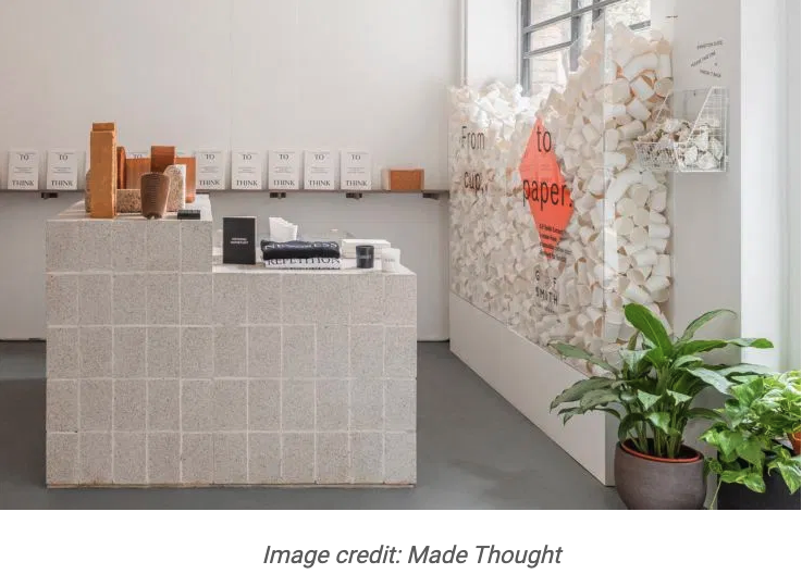
Design studio Made Thought has opened an experimental pop-up in London. It’s a space that’s intended to incorporate lots of elements you might expect from a website – from editorial content to installations that change weekly. Products are interspersed with this editorial content giving it the feel of a shoppable Instagram feed.
36. Moustache (Paris)
French design company Moustache’s Paris store features a stone interior that really lets the products shine. It resembles a cave with painted chalk whites to give the feel its displays have been carved out of stone.
The furnishing and design products are displayed within alcoves or set on plinths that curve into the walls – a detail that creates a beautiful aesthetic.
37. Museum of Qatar Gift Shop (Doha)
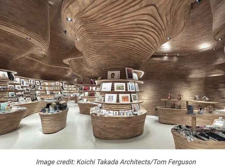
The Museum of Qatar Gift Shop in Doha is an extraordinary retail space. Featuring undulating wooden surfaces that make the store feel like a cave, it’s modelled on a mineral formation and was built with 40,000 separate pieces of wood. Amazingly, everything was assembled by hand by Italian carpenter Claudio Devoto. This gives the shop an aesthetic and a story that lives up to the museum itself.
38. Museum Store at MoMA (NYC)
The new Museum of Modern Art’s (MoMA) flagship in New York is full of attention-grabbing, bold displays. It features a two-storey bookshelf in the centre, and a 30-foot feature wall comprising 2,000 contemporary art publications. A glass elevator gives visitors the opportunity to truly take in this fantastic structure.
39. NikeLab Re-Creation Center (Chicago)
Louis Vuitton’s artistic director Virgil Abloh has teamed up with Nike to create NikeLab in his hometown of Chicago. Re-creation and sustainability is the big focus here, with walls lined with shoebox paper and the inventory displayed on plain cardboard signage. Seats, flooring and mannequins are all created from ground up Nike sneakers – and customers are invited to contribute their old trainers for this exact purpose. It’s the perfect example of how a cool, engaging space can be used from unusual and unloved materials.
40. Olfactory (NYC)
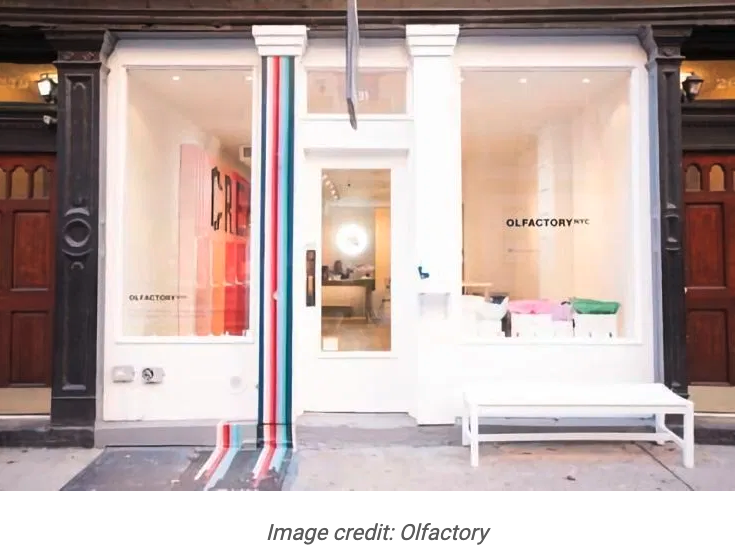
Olfactory in New York, the first and only physical space of the online perfume brand, focuses entirely on customisation. The nine base fragrances for every customised perfume are beautifully displayed on different colour backdrops – and these dominate the interior of the entire store. Because of this customers are immediately drawn to them to begin their fragrance journey. A large counter sits on the other side of the space where customers can discuss and finalise their concoctions.
41. Pass on Plastic (London)
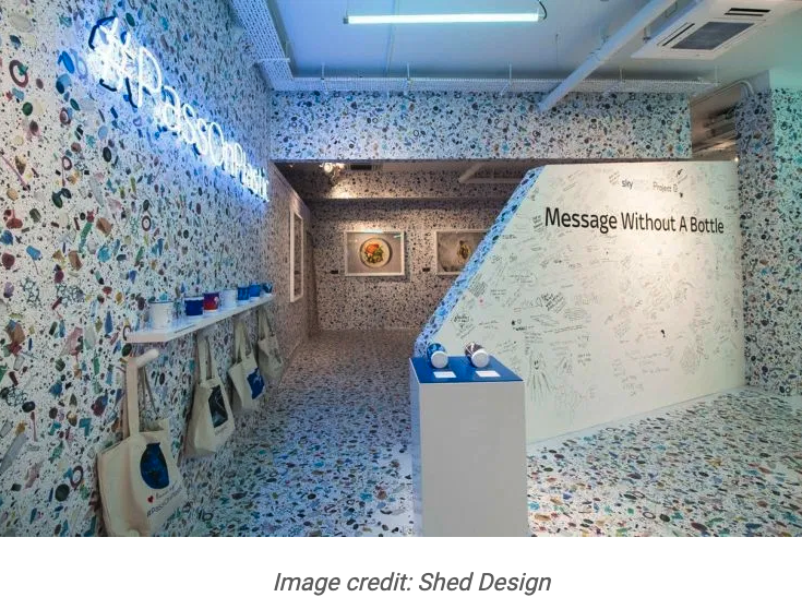
Pass on Plastic is a pop-up store in London that’s solely focused on raising awareness around the issue of single use plastics. The floor-to-ceiling wallpaper depicts plastic waste such as toothbrushes and plastic bags that from a distance look like a pretty, terrazzo print. Centrally, blue-topped plinths resemble islands in this sea of plastic waste. It’s a very arresting scene and an extremely important space.
42. Prada ‘Hyper Leaves’ (Paris)
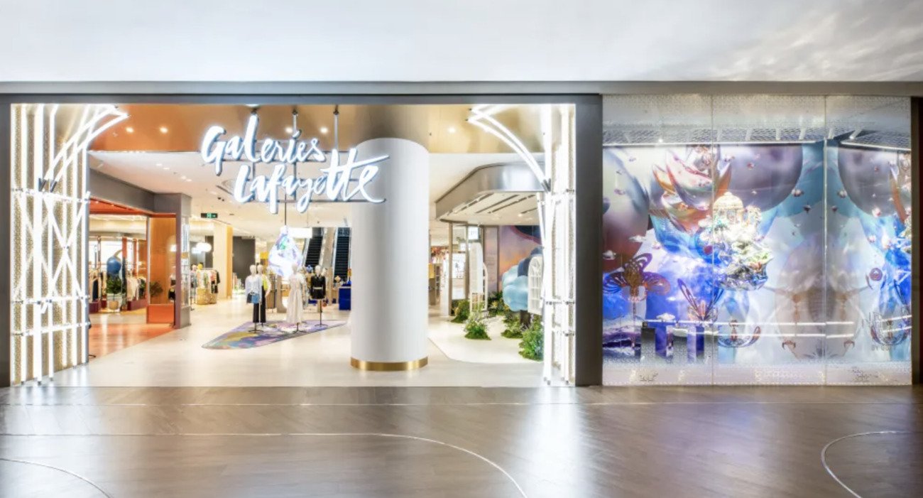
Italian fashion retailer Prada has teamed up with historic department store Galeries Lafayette Haussmann to create two pop-ups – one for men and the other for women. The neon green installations are inspired by the theme of ‘wild nature’. The women’s space features a forest pavilion whilst the men’s space has a giant baobab tree at the centre of it. With a colour scheme that’s unforgettable, these pop-ups are making quite a splash.
43. R13 (NYC)
R13’s flagship store in New York is full of innovative design flourishes. Large blocks covered in LED screens display projections but also double up as clothing displays. Visual content, which changes seasonally, is a key feature too giving the space the feel of an exhibition in certain areas. The exposed bricks and pipes contrast well with the modern products and installations.
44. The RealReal (NYC)
The RealReal is changing perceptions around pre-owned clothing having created a hugely popular online marketplace for buyers and sellers of luxury clothing. Its space in Soho, New York, brilliantly conveys the spirit of the brand – passersby would never realise they’re walking past a second-hand clothing shop. The rich and luxurious interiors and beautiful cafe all serve to support this sense of renewed luxury.
45. Reformation (NYC)
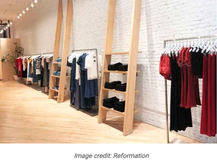
The fashion retailer Reformation’s store in Soho, New York, is an excellent physical representation of everything the brand stands for. Large screens allow customers to check stock and order items in different sizes and colours to arrive in fitting rooms – and this simple technology allows the space to not be overloaded with product. Instead it’s sparse, tranquil, and able to include lots of storytelling about its sustainable approach.
46. Rubio (Valencia)
Children’s publisher Rubio’s first retail space in Valencia is a bold and engaging store. It’s divided into very different sections, with an area full of nostalgic design for older generations, and a ‘time machine’ section supported by augmented reality goggles for younger readers. There’s also a ‘tunnel of colour’ – another way the retailer has worked to create a space that lives up to the imagination of the stories it sells.
47. Self-Portrait (NYC)
Self-Portrait’s NYC pop-up featured white and pink floral lace of varying lengths hung from six-metre high wooden plinths. The wall of lace was located in the entryway and designed to envelop customers as soon as they walked through the door. The womenswear brand called it a ‘journey of exploration, touch and discovery’.
48. Starbucks Reserve Roastery (Chicago)
The recently opened Starbucks Roastery in Chicago is the largest Starbucks in the world. It’s a multi-sensory destination featuring a 56-foot cask at the centre that works like an hourglass with the coffee beans filtering through its connected tubes. The spiral escalator wraps around the cask so customers can watch from all angles.
Another notable display is the mural by local artist Eulojio Ortega that depicts the planting, selection and processing of the coffee beans. Much like other Starbucks Reserve Roastery flagships, this is a Disneyland for coffee lovers where experience comes first.
49. Vans (London)
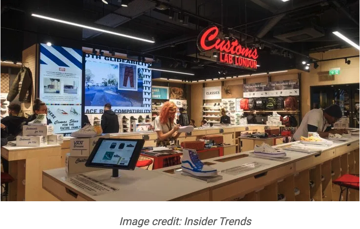
Vans’ new Oxford Street flagship is its largest store in Europe with a big focus on storytelling and customisation. A halfpipe display sits near the entrance, and dozens of product displays feature stories from the brand’s and skateboarding’s past. But the star of the store is the huge customisation desk in the centre, which sits all the way around its edge. Vans artists stand in the middle customising sneakers by hand all day long – and customers are encouraged to join them.
50. YJY Maike Centre (Xian, China)
The YJY Maike Centre Flagship is a bookstore and commercial complex in Xian, China that almost defies belief. The idea was to create a library, gallery and public space – but that doesn’t really do justice to the vast 4,500 metre sq store. Illuminated 10-metre high bookshelves dominate the space and arch over entrances, with a huge spiral staircase in the middle of it all. Lush seating areas rest in amongst the books creating a truly incredible place to read, socialise and flick through potential purchases.
Via Insider Trends
 English


