Current Creative Retail Trends to Love Right Now
Experience the exciting world of today's retail and discover the latest trends that are revolutionizing the industry. From immersive in-store displays to personalized shopping experiences, the retail landscape is constantly evolving, offering a wide range

Experience the exciting world of today’s retail and discover the latest trends that are revolutionizing the industry. From immersive in-store displays to personalized shopping experiences, the retail landscape is constantly evolving, offering a wide range of engaging opportunities. In this article we’ll highlight the current pulse of creative retail that is sure to captivate your senses and inspire your shopping adventures.
The Phluid Project
Perhaps the first ever gender-neutral store, The Phluid Project, has recently opened in New York.
Why so fab?
It chimes with the Gen Z mentality. It feels like the discourse around gender and identity has never been so omnipresent and GenZ is arguably the first generation to really embrace gender fluidity as mainstream. So the Phluid Project has launched just at the right time – the environment, clothes selection and ethos is exactly what more and more young people crave. Founder Rob Smith says, “Phluid is a space for young people to be free and have a voice in a real tangible space.”
The thoughtful ethos and execution. Unlike some attempts to win over gender-fluid or trans communities, this store does not feel contrived. An awful lot of thought has gone into how to cater for bodies of different shapes and sizes whether they be male or female, even the mannequins have been specially designed with high protruding busts and narrow hips, so they could be either sex. Plus, the sales assistants are members of the gender fluid communities, truly embodying the brand and also ensuring shoppers feel comfortable.
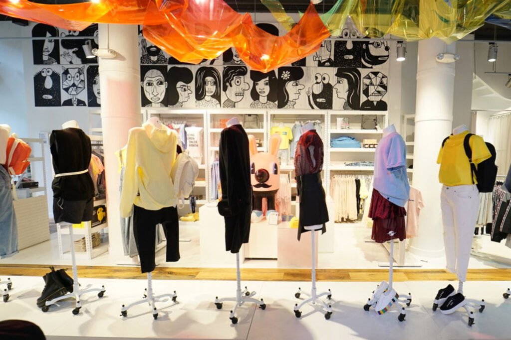
The artistic interior. Gender-fluid does not mean boring. This store may have low-fi bones with minimalist white walls, concrete flooring and shipping container-inspired merchandising units, but it’s lent vibrancy with neon lights, Jeff Koons-esque VM props and fun graphic moments akin to a Marjane Satrapi graphic novel or Keith Haring canvas.
Self-Portrait London
London-based fashion brand Self-Portrait, famed for its beautifully modern lace dresses, has recently opened its first standalone store in Mayfair.
Why so fab?
It’s embracing the direct-to-consumer business model. For a relatively small fashion brand that doesn’t have the backing of a big conglomerate like LVMH, it’s quite an unusual move for Self-Portrait to open its own store. However, we are seeing a switch towards this direct-to-consumer model across retail and it makes sense for a number of reasons. Founder Han Chong cited said, “ It allows us as a brand to really let our customers see how the brand lives. I wanted everyone to get to know Self-Portrait personally.” Ultimately it allows Self-Portrait to control its own brand experience.
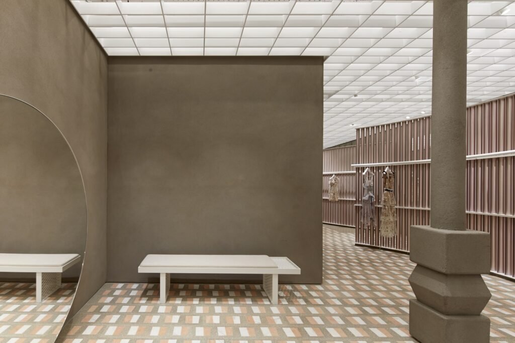
The sweeping interior. Designed by Casper Muller Kneer Architects – the same team behind the White Cube galleries and Céline –the interior is deftly constructed to feel like a series of sleek alcoves which the customer can explore. Subtly textured terazzo floors, gigantic round mid-century mirrors and curved metal screens bring a sense of playfulness to the muted Cornish minneral clay walls.
The store’s offer. It launched with a limited collection of exclusive pieces and Chung promises a roster of collaborations coming in the near future. There’s also a high level of service with in-house personal styling appointments offered and a tailoring service that promises 90-minute door-to-door delivery within London.
Benetton
Italian fashion brand Benetton has been a bit quiet on the High Street recently so this new West End flagship marks the start of a new era.
Why so fab?
The use of technology. Creating an instant statement are the huge 12m high LED screens at the façade which feature content designed by Benetton’s in-house research team, Fabrica. Dotted throughout the store are shiny black interactive touch tables that allow customers to browse the full product range and view complimentary items and outfit suggestions for each look. Benetton has also introduced express checkouts, each assistant has an iPad and card reader to take payments – great for avoiding dreaded queues.
It values time well spent. The store is designed with dedicated seating zones complete with magazine, books and iPads to keep customers entertained. This is a simple and thoughtful way of providing a timeout space away from the frenzy of Oxford Street.
The fresh design. The 1,500m² store has a clean and contemporary look with natural wood, iron and stone finishes and sleek mid-century lighting. An impressive loop-shaped staircase joins the different departments and lends the space a lofty feel. Overall it feels generously proportioned with lots of space to browse each section. However it’s not completely minimal, in the Knitwear section, for instance, the brand’s signature colourful knits are piled high.
The Source Bulk Foods
The Source Bulk Foods is an Australian food store that’s all about sustainable shopping with zero waste. It’s just opened its first UK store in Chiswick, London.
Why so fab?
It tackles waste head-on. Excess plastic is one of the biggest environmental challenges we face and it feels like buying product wrapped in plastic from your average supermarket or food shop is unavoidable. This store solves that by having pick and mix-style self-service counters that allow customers to carry their items in a recyclable container – customers can also bring in their own containers. The content is then priced by its weight.
It’s a fun experience. There’s something satisfying about watching your food or household products pour out of a dispenser and into an earthy woven sack or neat cardboard box. It’s a lot more enjoyable than heading into a supermarket and picking up a packet – also it encourages customers to think more about how much they actually need, and then hopefully waste less.
The traditional interior. Suitably the store is all wood, exposed brick walls and industrial shelving units. It’s accessorised with cereals and foodstuffs in traditional glass jars, and the carrier bags are inspired by traditional woven bags that wouldn’t look out of place in a 1920’s general store.
Bulletin Broads
Manhattan-based start-up Bulletin Broads is bringing previously online-only products offline with this new bricks and mortar store.
Why so fab?
The business model. Bulletin Broads describes its model as the “WeWork for retail”, brands that exist solely online can rent anything from a shelf to a whole corner of the store to display their product. Bulletin Broads is more a media channel or “the physical embodiment of a lifestyle blog” as said CEO Alana Branston.
The feminist ethos. All the brands stocked are female-led and many of the products are embellished with female empowerment messages. For instance illustrator Kimothy Joy’s totes are scrawled with slogans like ‘unreasonable woman’ and ‘we are the leaders’. The store also gives 10% of its profits to the Planned Parenthood organisation. Inside the store, the brand’s feminist mission statement is boldly written across a pink wall.
It’s like walking into a real-life Instagram. Made to service a very particular type of customer and with a high level of curation, walking into Bulletin Broads feels a bit like stepping inside the aspirational feed of a cool Manhattan dweller. The clean white box-like space is brought to life with trendy mirror stickers, tactile fur-faux fur, aces and luscious plants.
Via Dalziel & Pow
 English


