English


When Copenhagen Became a Flat-Pack: IKEA’s Playful OOH
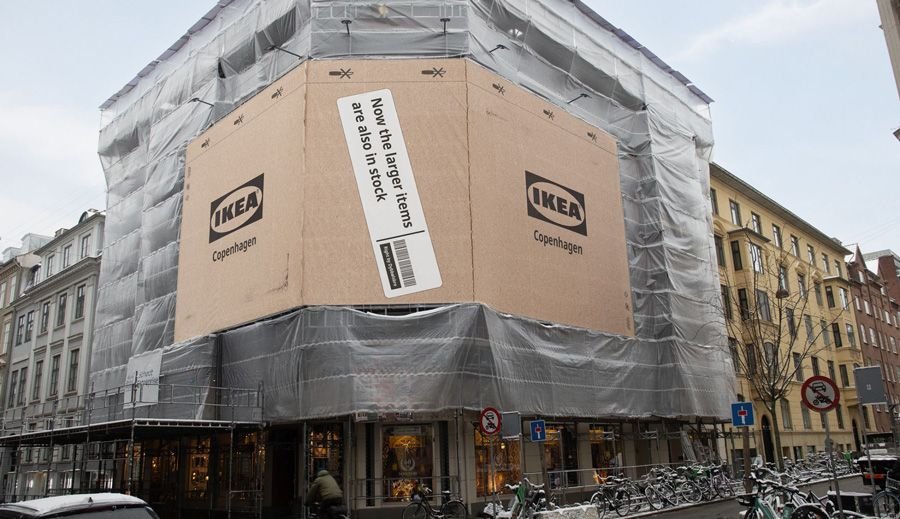
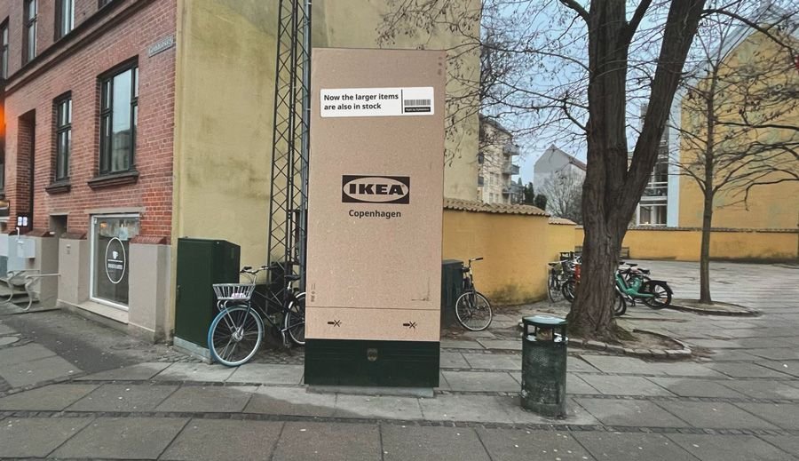
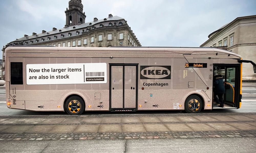
If you’ve ever strolled through Copenhagen recently and thought the city had suddenly turned into a giant cardboard sculpture, you weren’t imagining it. IKEA’s latest outdoor campaign literally wrapped the city in flat-packs, turning buses,
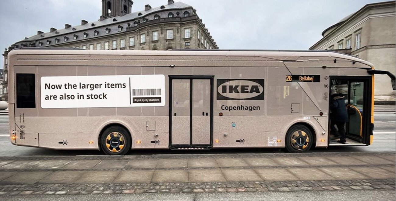
If you’ve ever strolled through Copenhagen recently and thought the city had suddenly turned into a giant cardboard sculpture, you weren’t imagining it. IKEA’s latest outdoor campaign literally wrapped the city in flat-packs, turning buses, buildings, shelters, and scaffolding into oversized versions of the brand’s iconic brown boxes to deliver a simple but smart message.
Why flatpack a city?
At first glance, this feels like one of those ideas that lands instantly: fun, bold, and unmistakably IKEA. But the strategy behind it is sharper than a Swedish hex key.
IKEA’s city-centre store in Copenhagen has long been beloved as a source of browsing and inspiration, a place to soak up design ideas. But locals tended to assume that if they wanted big stuff, e.g., a sofa, a wardrobe, or a bookshelf, they’d still have to make a pilgrimage to the out-of-town warehouse. That perception was costing IKEA potential sales right in the heart of the city.
So the brand did something audacious yet simple: rather than hiding behind a carousel of product shots or price tags, it leaned into its most iconic visual, the flat-pack box, and used that to say exactly what it wanted people to believe: “Now larger items are also in stock.”
When OOH becomes proof, not just a promise
What makes this rollout so effective isn’t just scale, although seeing a tram or a scaffold draped in oversized cardboard is undeniably eye-catching. It’s the clarity of purpose. This isn’t about clever wordplay or flashy visuals; it’s about turning a logistical upgrade (bigger inventory available for same-day pickup) into something people can see and feel in their everyday environment.
In a media environment cluttered with offers and hyperbole, IKEA chose restraint. There’s no product hero, no price battle, and no “limited-time” urgency. Just a city that looks like a giant parcel ready to be taken home, and a message so literal that it resonates instantly.
Why it works
It reframes perception, not just awareness. The campaign rewired how Copenhageners think about IKEA’s city store, from a showroom of dreams to a destination for real purchases.
It uses a core brand code. Flat-pack cardboard is a cultural shorthand for IKEA’s values of practicality, accessibility, and everyday usefulness.
It embeds itself in the city. By turning everyday urban infrastructure into part of the idea, IKEA made its message feel native. not intrusive.
A reminder about simplicity
In an era where brands chase ever more complex storytelling, IKEA’s Copenhagen activation is refreshing precisely because of its simplicity. It doesn’t shout about its belongings; it shows you the idea and trusts that you’ll make the connection yourself.
After all, once you see the city boxed up like an IKEA product, the message packs itself!